Grace & Providence Apps
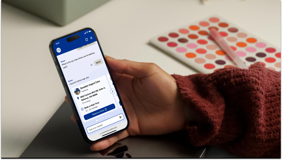
Leading the design and creation of AI-enabled mobile native and web experiences, helping more than 2.6 million patients navigate access to healthcare.
Role
Head of Design / Product Design Manager
Client
Providence Digital Innovation Group
Timeline
2021 - 2023
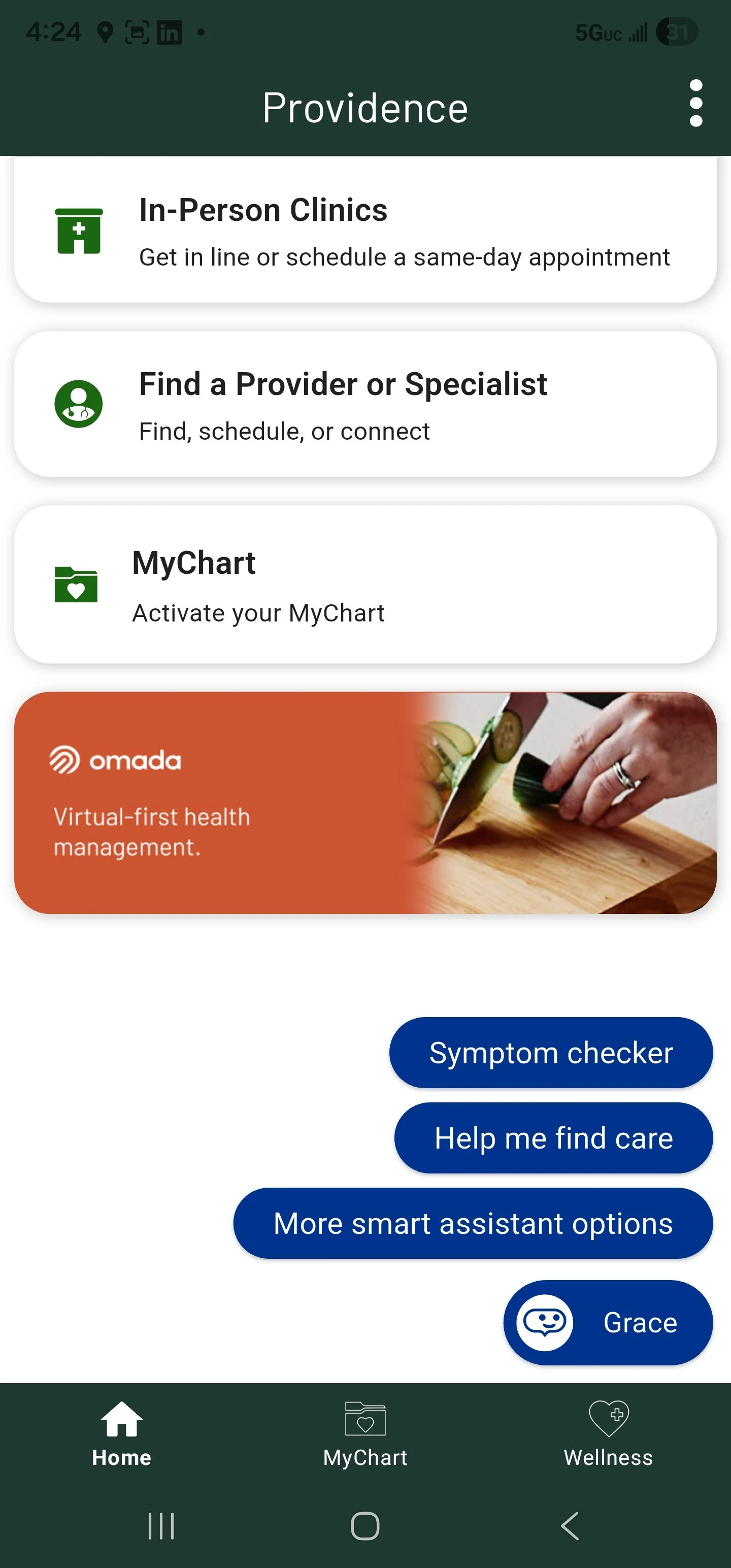
Grace, CEP apps and Partner Cards are still live in 2026
At a glance
Problem: Grace was a decision-tree click-bot with a 1% open rate, serving only 800 monthly active users, in a health system with almost no appetite for AI risk.
What I did: Rebuilt it as a conversational assistant, authored the voice, escalation and design systems behind it, got clinical sign-off on every flow, and managed a five-person team across multiple mobile apps, a core design system, and an SSO product.
Outcome: Open rate 1% to 8%, return rate 13% to 30%, and monthly active users 800 to 150,000, serving 2.6 million patients across MyChart in seven states. Inconsistencies between iOS and Android down by roughly 95%, and a patent application for contextual shortcuts. Grace and the partner cards are still live in 2026.
Situation
In 2021, Providence Health & Services was navigating the aftermath of COVID-19: caseloads were rising, and caregivers were burning out and leaving the field in large numbers. At the same time, Providence, a Catholic non-profit health system, had launched the Providence Digital Innovation Group (DIG), an internal startup incubator designed to use the health system itself as a platform to build for-profit companies, retaining an equity stake as a long-term strategy to bring revenue back into the hospital and expand access to care.
Task
I joined Providence in 2021 to build and manage a team responsible for several product initiatives: Grace, a cross-platform conversational AI assistant deployed on web, iOS, and Android; the Consumer Engagement Platform (CEP), a white-labeled patient navigation app launched as both the Providence and Swedish Health apps; and a single-sign-on product called Single Patient Identity (SPI).
I worked as a player-coach, serving simultaneously as an individual contributor and the manager of a five-person team. I had direct IC responsibility for Grace, while building the environment for my team to succeed on the other initiatives. Sometimes that meant stepping in, sometimes stepping aside, and always leading by example.
Actions and Outcomes
Fixing Low Engagement at the Root
When I joined, Grace had an open rate of about 1% and a return rate of 8%. It had launched as a decision-tree "click-bot" with no natural language understanding, built quickly to increase access to COVID-19 resources. One of my first moves was to champion a conversation-first product principle, making an open text field always available, and to advocate for a change to Grace's underlying engine to support true NLU. The team moved off Watson and onto Rasa, and eventually shipped the always-available text field. That was the first step toward what eventually became a full redesign of the agent.
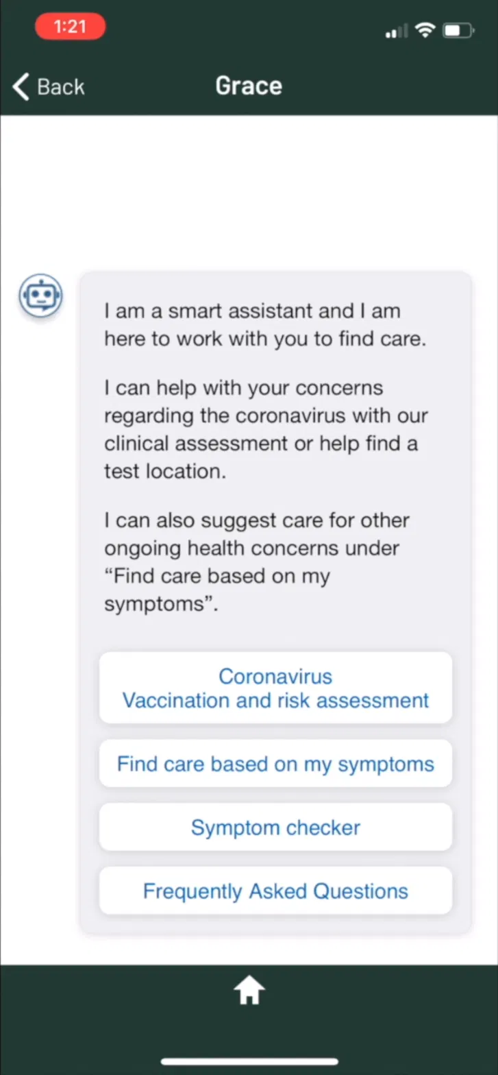
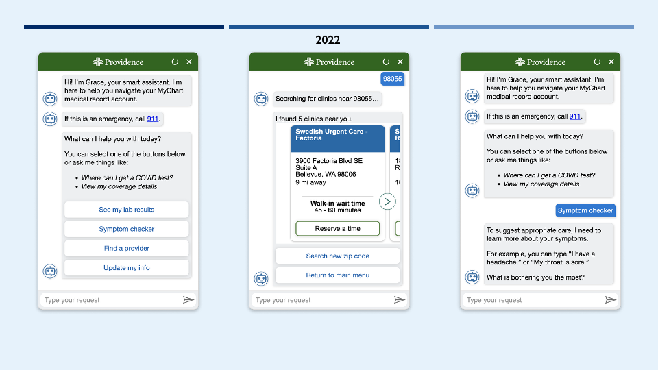
Grace click-bot in 2020 before I joined
Conversation-first meant opening with a question rather than a path. The alternative was to keep steering people through a decision tree or a form, which is what the click-bot did and what the engagement numbers reflected.
Major Redesign
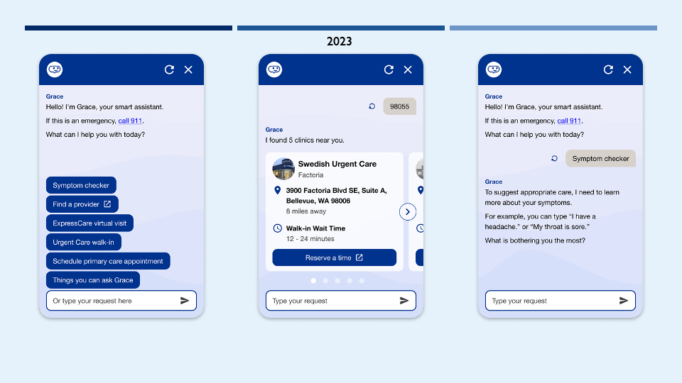
The redesign covered three things: modernizing the look and feel, building a genuinely conversational experience in place of the old decision-tree structure, creating escalation logic, and establishing consistency and continuity across pages and platforms. Delivering on that meant creating not just designs but the operational infrastructure to support them. One step in that process was leading the creation of a style guide covering interaction patterns, motion, sound, and conversational guidelines, with responsive look-and-feel rules spanning iOS, Android, web, and mobile web. I selected Zeroheight, in combination with Figma, as the documentation backbone for that system, while using design tokens and component libraries in Figma to ensure visual decisions remained consistent as the system scaled across teams.
As part of the redesign, I authored Grace's conversational guidelines, voice and tone principles, response patterns for Grace's core intents (symptom checking, finding a provider, lab results, coverage questions), and the escalation logic shown below: when Grace should answer directly, perform a task, deep-link to another app or site, or hand off to a human when a request was outside what it could safely handle. Those guidelines became the shared reference for how every new flow was designed, and directly informed the Zeroheight style guide I initiated. I also drove the fix for a critical conversation-continuity issue, state loss on page navigation, before rollout, unblocking the technical foundation the rest of the redesign depended on.
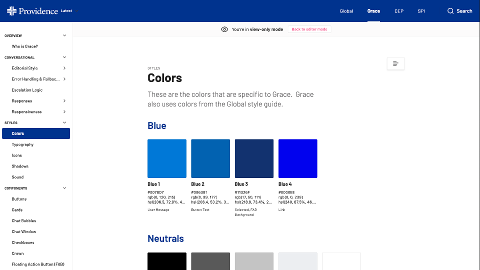
Zeroheight Style Guide
(visual, conversational, sonic, motion)
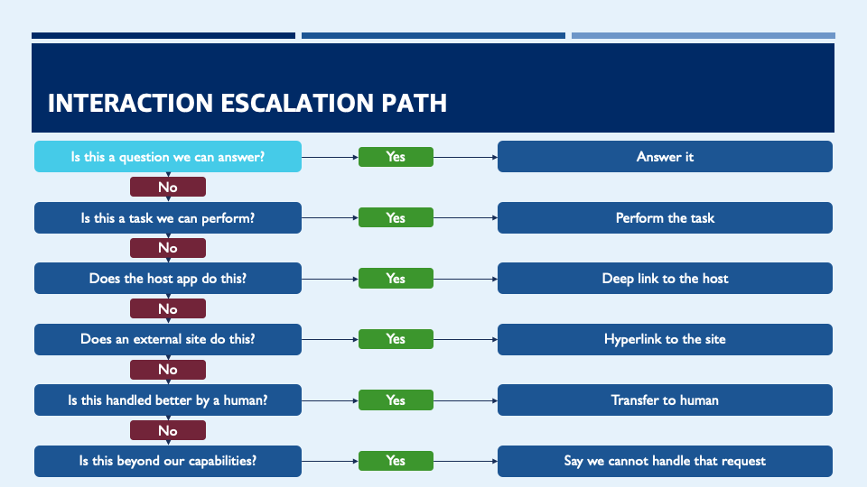
Grace Escalation Path
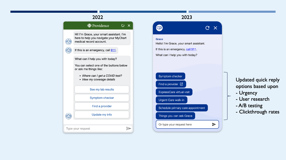
Before and after
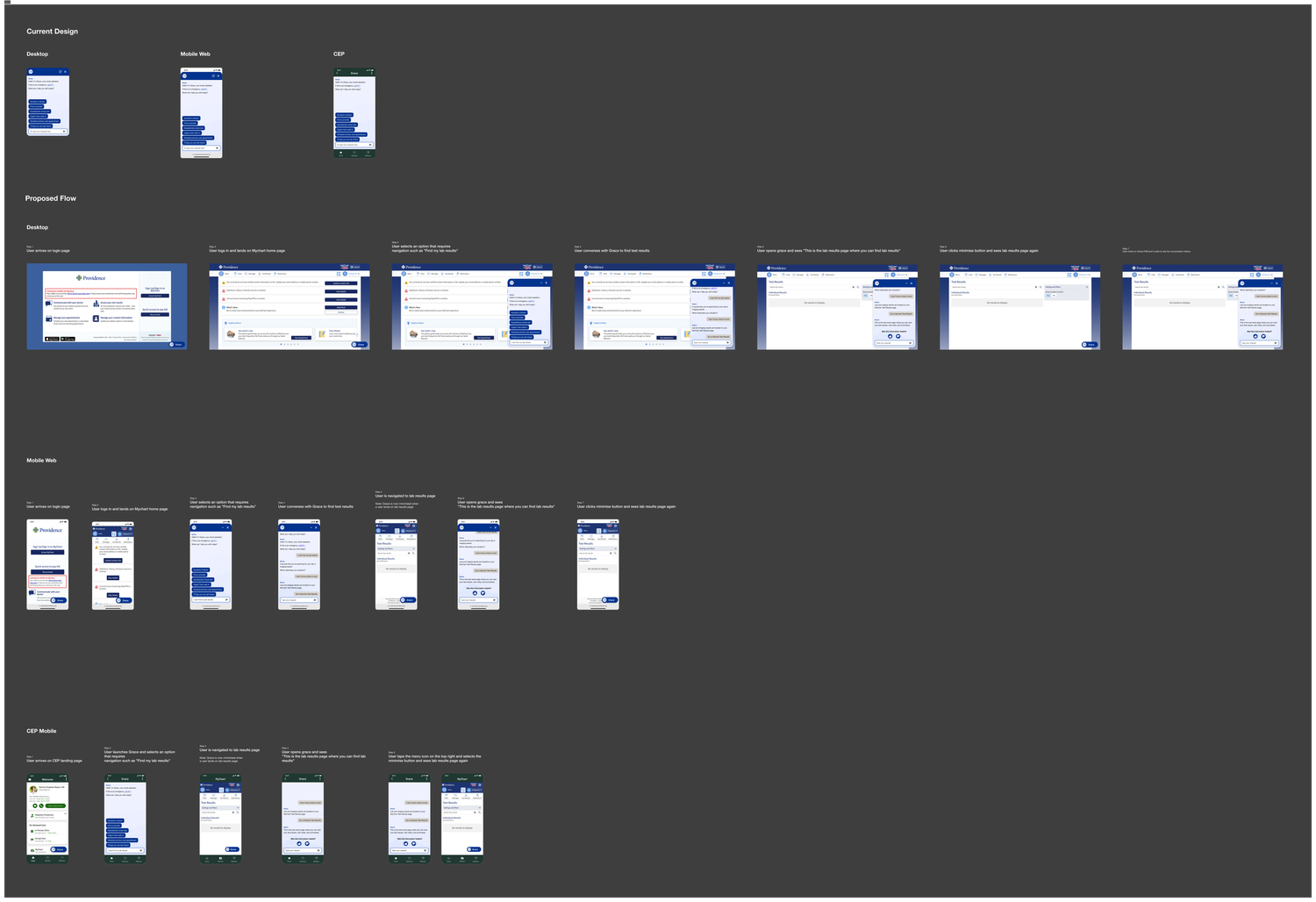
Cross-platform concept development
The scope that got cut was the visual ambition. We wanted responsive typography, motion, and glassmorphism, and all of it cost more engineering time than we had, so it lost to features the launch actually depended on.
Working Inside Healthcare’s Constraints
Healthcare has a low appetite for AI risk, for good reason. Generative AI needs real guardrails to stay compliant with PII and PHI regulations and to avoid ever crossing into unreviewed medical guidance; Grace couldn't train on someone's personal lab results or start giving advice it wasn't cleared to give. I worked closely with doctors and nurses in regular working sessions to vet every conversational flow, which became a genuinely productive model for bringing diverse expertise to bear on the same problem.
When it came time to launch, I presented to hundreds of caregivers across Providence Health to build buy-in for rolling out Grace within MyChart and across clinic websites in Alaska, Washington, Oregon, California, Montana, New Mexico, and Texas.
iOS + Android inconsistencies
I make a habit of using the products I build, and while doing a deep dive into our apps, I started noticing inconsistencies between the iOS and Android versions, including formatting, interactions, and color palettes. The causes were mundane but real: no style guide yet existed, design artifacts were treated as suggestions rather than rules during implementation, colors were sometimes sampled from lossy screenshots, and design docs occasionally left questions unanswered that engineers then resolved with their own judgment calls. I did a full side-by-side walkthrough of both apps, built an inventory of every issue, and had my team do the same. We surfaced dozens of inconsistencies and worked with engineering to prioritize fixes, reducing inconsistencies between iOS and Android by roughly 95%.
A style guide was the fix I could reach. We had no QA function that owned visual consistency across platforms, since testers were assigned to iOS or to Android, and engineering was two separate teams. Whoever was implementing a screen would sometimes guess at anything a Figma file did not state outright, which is where much of the variance came from.
AI-enabled Figma Plug-in Experiment for Flutter Code Migration
Around the same time, engineering decided to migrate our native mobile apps from Swift and Java to a unified Flutter codebase, allowing us to build once and deploy to both platforms. I saw an opportunity to streamline Figma-to-code translation and, with ChatGPT's API newly released, worked with two developers during an internal hackathon to build a plugin that exported Figma frames as Flutter code that matched our design system. We built it in under a week and proved it worked: it exported a design-system-compliant button. It also surfaced a real limit. The interaction logic around that button isn't captured by Figma frames, so that logic still had to be written by hand.
Logic trees, the universal card
Building for cross-platform experiences meant designing for wide variation in what context our systems knew about a given user. I built a logic tree showing how Grace's entry portal paths should adjust it’s display and content based on platform and user context. This led to a patent application for contextual shortcuts. Leading by example with that logic tree, I worked with two designers on my team to design "universal card" patterns for the app's home screen.
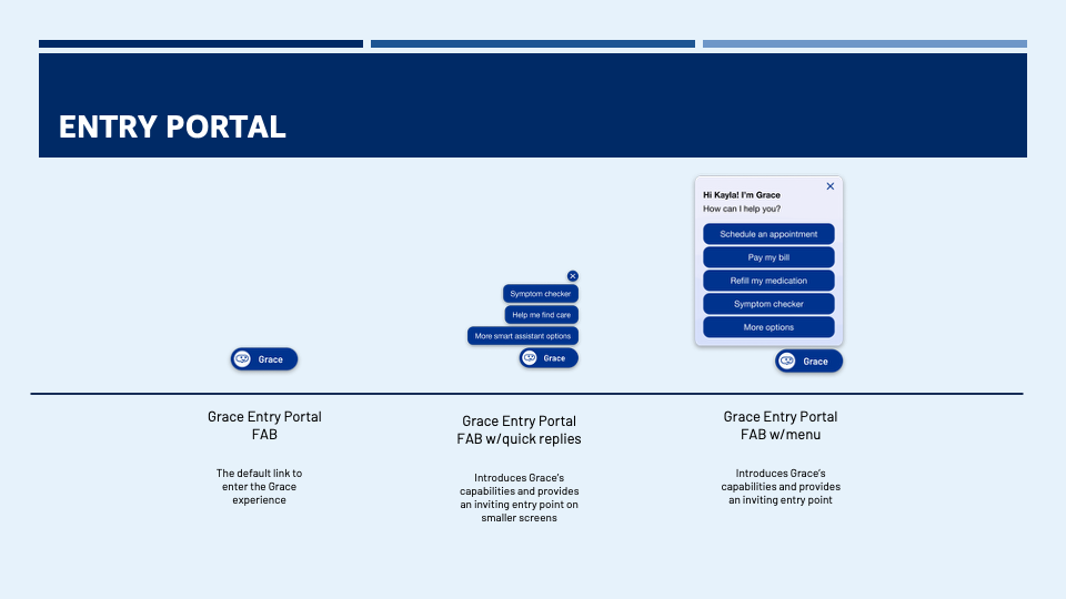
Grace Entry Portals
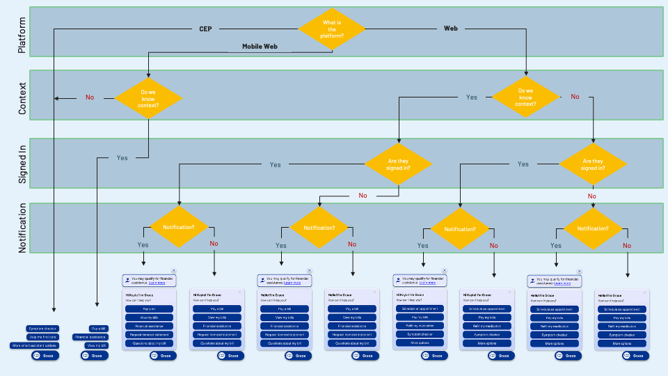
Grace Floating Action Button (FAB) Cross-Platform Logic
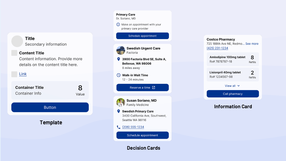
Grace’s Universal Cards
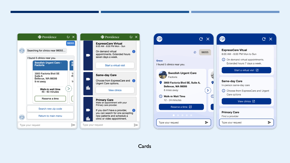
Fixing Inconsistency - Before and after Universal Cards
The alternative was what had been happening before I joined: a one-off card designed for each use case. Universal cards were a bet that one well-specified component covering every case would be worth more than the flexibility of designing each one, and consistency was what made the product easier to use.
Partnership
One challenge was representing external partners, such as Omada Health and Credina, in a way that felt true to each partner's brand while staying consistent with our in-app experience. Building upon the great work from designers on my team, I refined a template for these third-party cards, sharing it with partners, allowing them to adapt it while keeping it consistent with our design language. The card format is still in use in the app today. I was directly involved in the sharper tradeoffs behind this work, including defining the analytics needed to make the business case legible: card impressions, click-through, and downstream program downloads.
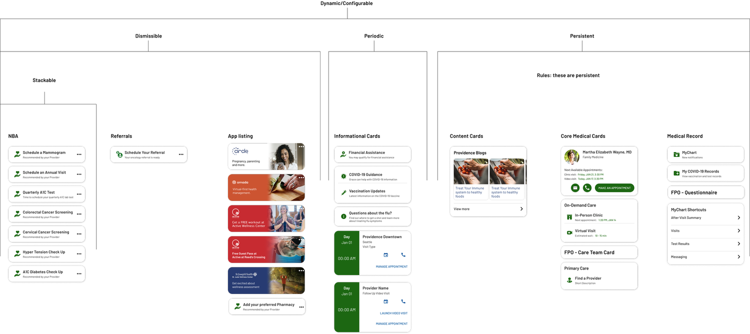
Taxonomy and artifacts from my team
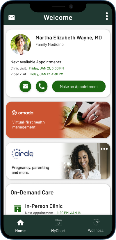
Partner card template
Sharing the template was itself contested. There was internal pushback on giving partners the file at all, and the reason was never made clear to me. I got it to Omada Health, after which sharing was restricted.
Grace's logo
In 2022, I documented my exploration into using prompt engineering to explore AI-enabled workflows, designing a new logo for Grace, generating concepts in Midjourney, refining them in Figma, and exploring emotional expression and seasonal treatments before showing the mark in context as a pop-up icon. I later simplified that design further into the icon that represents Grace today.
Result
Grace's native in-app and web presence from this work is still live today, durable, shipped interaction design, not a one-off mockup.
- Engagement: The move to real NLU and the full redesign took Grace from a 1% open rate, a 13% return rate, and 800 monthly active users, to an 8% open rate, a 30% return rate, and 150,000 monthly active users.
- Design system: The Zeroheight style guide gave the team shared rules instead of one-off judgment calls, a format that was expanded and adopted by all our product teams.
- Safety & buy-in: Clinical vetting kept every flow within healthcare's compliance guardrails; the presentations I gave to over 200 caregivers as part of our roadshow secured rollout across MyChart to 2.6 million patients and clinic sites in seven states.
- Native presence: Grace's in-app entry point is still live today. The universal card pattern gave the business partner-facing engagement and conversion data.
- Floating Action Button (FAB) shortcut menu: Grace’s usage-based curation approach became a filed patent application.
- Cross-platform consistency: My cross-platform audit efforts subsequently reduced iOS/Android inconsistencies by ~95%, tracked directly.
- Figma-to-Flutter plugin: A week-long experiment that surfaced a real limit ahead of the field: interaction logic isn't captured in Figma frames. It stayed a prototype.
Together, this is what mobile and web design experience actually looked like on the ground: native entry-point decisions made against real platform constraints, a partner-facing feature built to move a business metric, and a systems-level effort to keep platforms honest with each other.